Navigation Design
UX research & design, De Bijenkorf


The project.
When: 2018 – 2019
Where: De Bijenkorf
My role: UX research & design
As a team member within a cross discipline squad focused on improving the customers orientation when landing on our e-commerce platform, I was responsible for exploring how we could provide the most engaging & intuitive navigation.
My responsibilities ranged from customer / data research to ideation and final design. Working agile, I defined various stages of development through A/B testing proposals in order to finally validate the final design.
Achievements:
My process.
Discover
Discover key customer needs through qualitative and quantitative research.
Design
Design and test the best solution for solving the customer & business problem.
Deliver
Deliver final Design System assets and measure the business & customer impact.

Discovery process
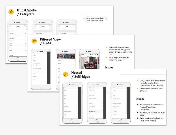
1. Desk research & competitive analysis.
Learn from industry standards
Completed a usability audit, reviewed best practices from Baymard and other sources, and explored how competitors are already solving similar problems for customers.
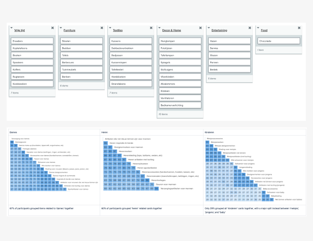
2. Card sorting & customer surveys.
In order to understand how our customers might structure products within our website, we conducted an online card sorting. In addition, continual monitoring of customer surveys were reviewed in order to understand potential problems.
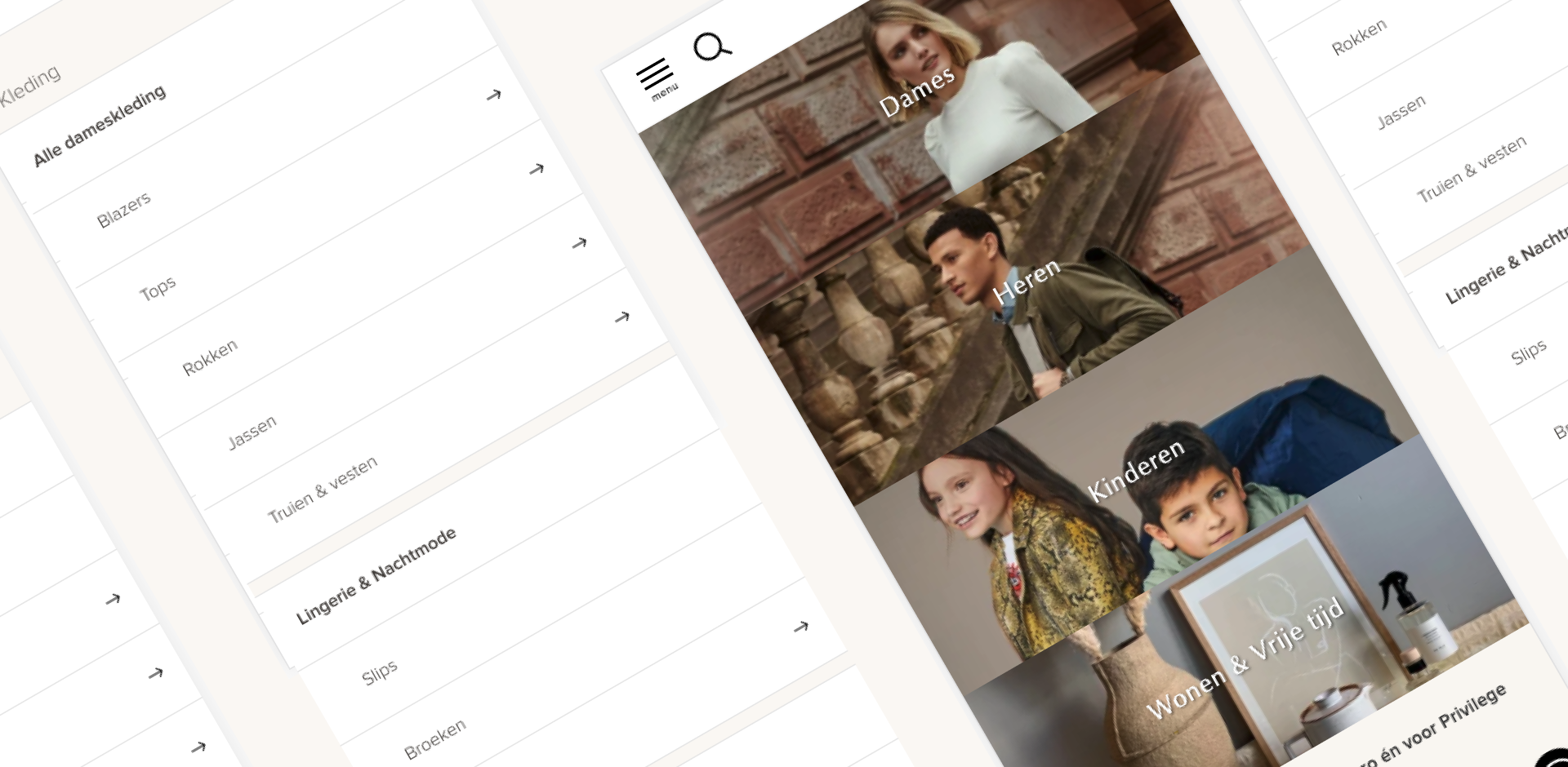
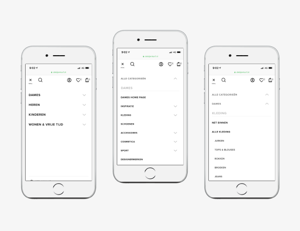
The result was going from the original 8 top level structure to just “4 worlds”, similar to how the physical department stores were also set up. Thus the following simple and easier to use top level:
- Dames
- Heren
- Kinderen
- Wonen & Vrije Tijd
3. Online session analysis & data analytics.
An interesting place to get started with any project is to explore how customers are currently using the product. For this project I explored session usage within our SessionCam tool and completed a brief data analysis within Google Analytics.
Design process
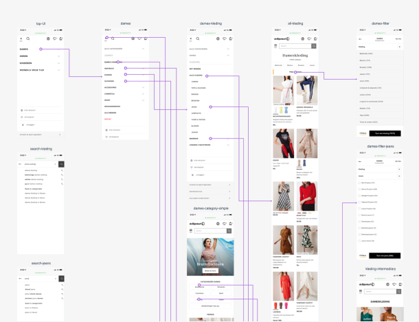
4. Wireframe & prototype.
Initial design ideas discussed with various business and design team members with quick designs mocked up in Sketch. These designs then uploaded into Marvel to create a quick prototype.
5. User testing of prototype.
Using an interactive Marvel prototype, store testing was completed with customers in order to understand where improvements could be refined further.
6. Exploring alternative UI patterns.
Understanding where the UI needed further refinement based on the user test results, the design patterns were then reviewed and discussed with the full UX design team before finalizing a direction.
Deliver process
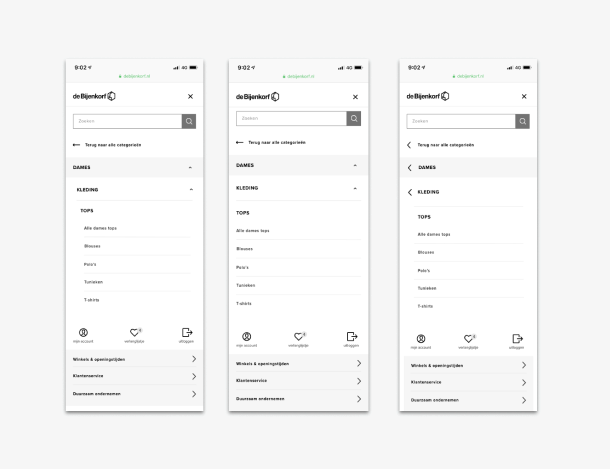
7. Finalize UI.
Initial design ideas discussed with various business and design team members with quick designs mocked up in Sketch. These designs then uploaded into Marvel to create a quick prototype.
8. Handover to development.
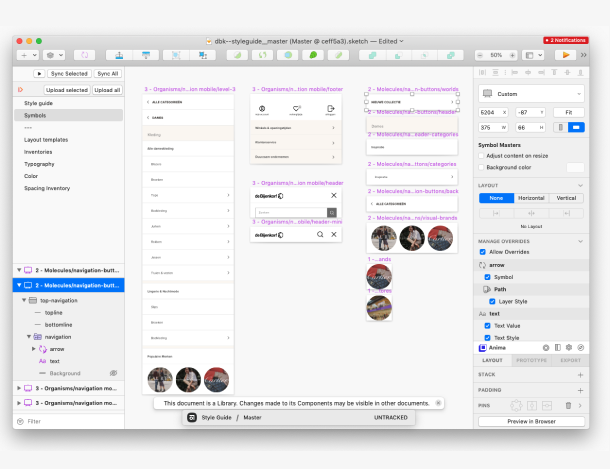
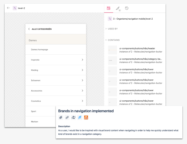
Delivering within the Design System.
Sketch designs published into our Design System on Zeroheight with usage documentation for developers and designers. Completed any development discussion while creating the necessary development tickets in Jira.
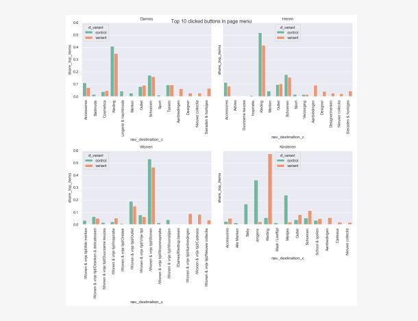
9. Plan A/B test hypothesis.
As part of delivering the final product, the plan for how to test and learn from the changes are discussed with business stakeholders and then a final hypothesis is created along with the requirements for creating the A/B test.
The result.
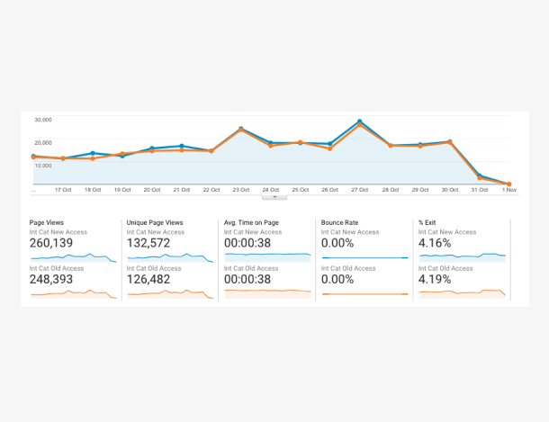
An easier to use, clean mobile first navigation that significantly improved usability and ensured a seamless customer experience across all devices.
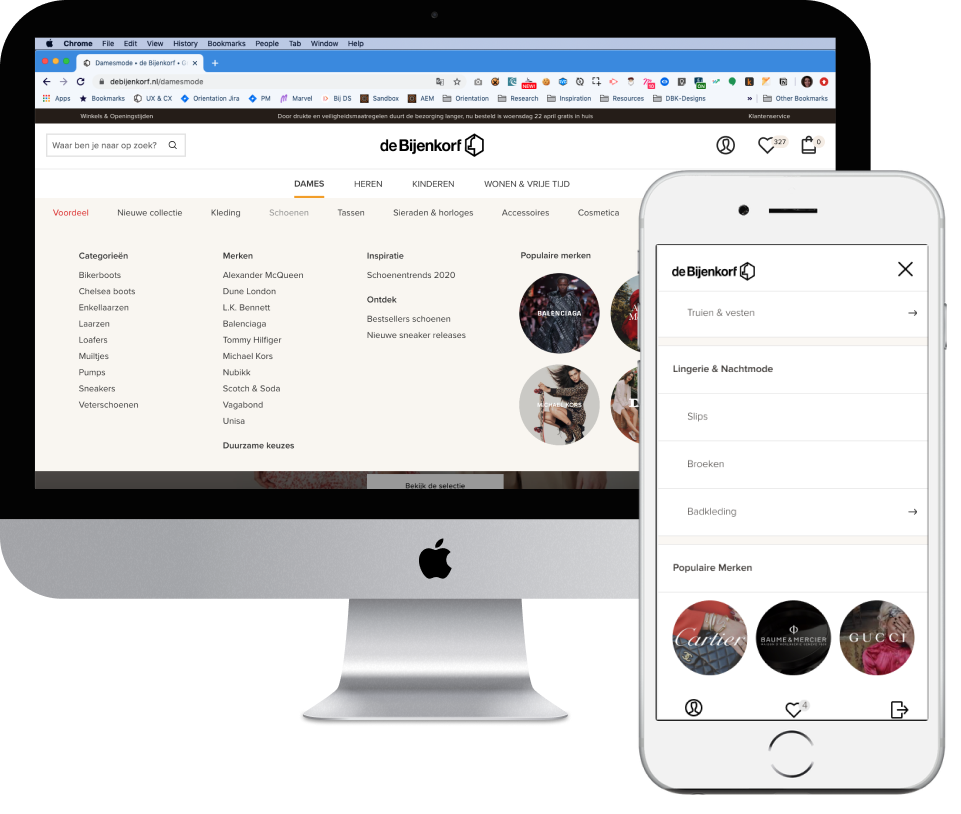


But that's not all!
The project included a robust navigation system for efficient modification. A huge project with huge impact!