
Glimz
A playful visual layer on top of the health data you already keep in Apple Health. Turn familiar stats into cards and changing views, and share a small glimpse with someone you trust.
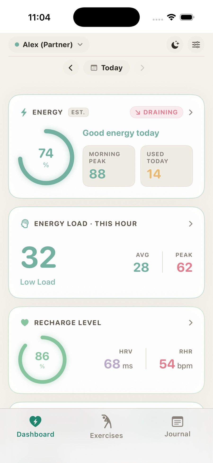
Health apps either feel clinical, or ask you to track more
There's no low-effort way to make sense of the data Apple Health already stores. And no easy way to share a small, intentional view of how you're doing with a partner, without handing over your entire health history.
Anyone who uses Apple Health and wants a clearer, more enjoyable way to see their patterns: cycle-related changes, sleep, activity, energy, and other selected data. One person opens the app; partner sharing is optional.
Turn existing Apple Health data into visual, personal insights. Make understanding yourself feel lighter, not heavier. Offer an optional "loop someone in" feature so a partner can see a small, current glimpse. Keep everything private and on-device.
Not a medical device: no diagnosis or treatment claims. Data never leaves the device. A playful experience layer, not another tracker. Clear, simple language everywhere, including the App Store listing.
A new lens on data you already have
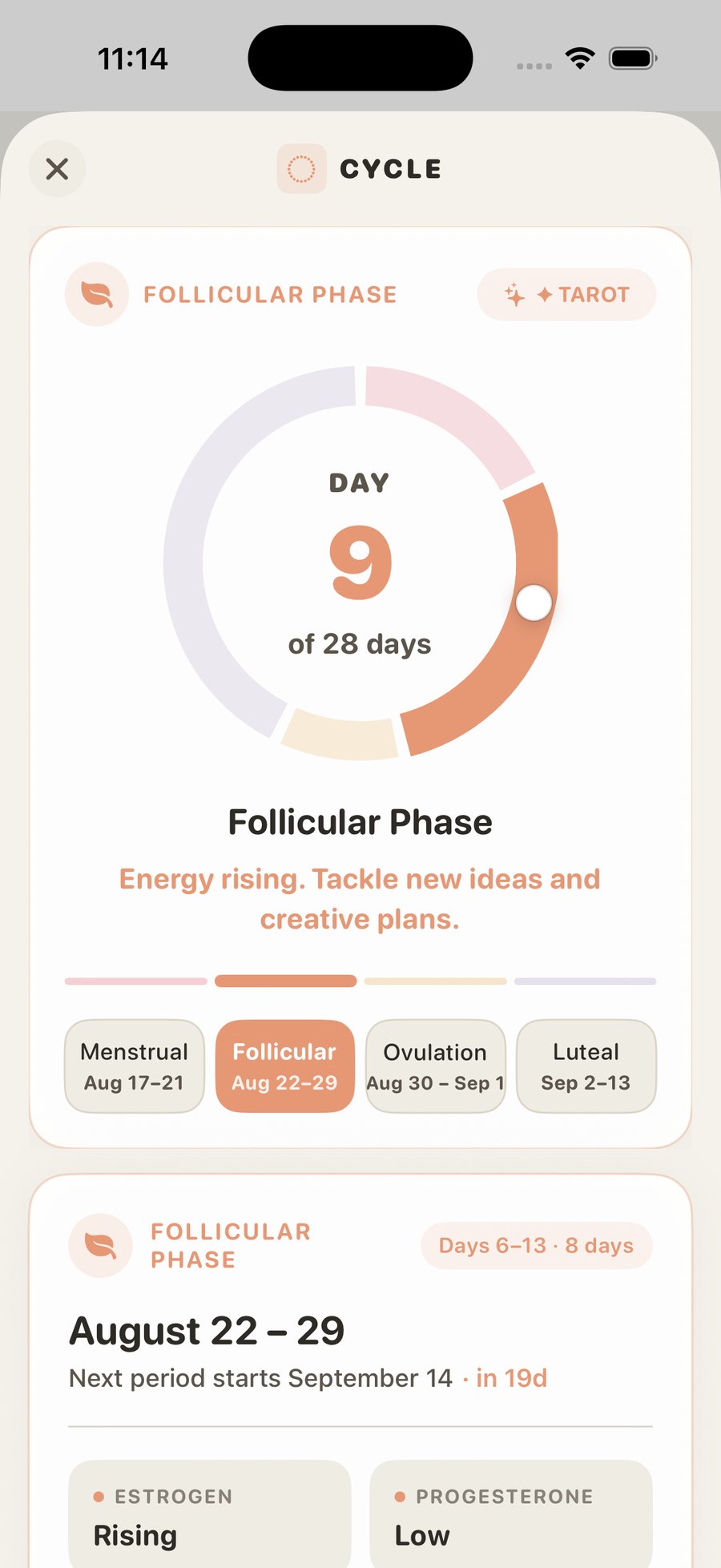
Glimz reads selected Apple Health data and turns it into visual cards, themes, and changing views. You pick the colours, the tone, and the visual style, from calm to delightfully cheeky.
It highlights recurring patterns across activity, sleep, cycle information and more, without predicting or diagnosing. It helps you notice what might be shaping your day, this phase, this week.
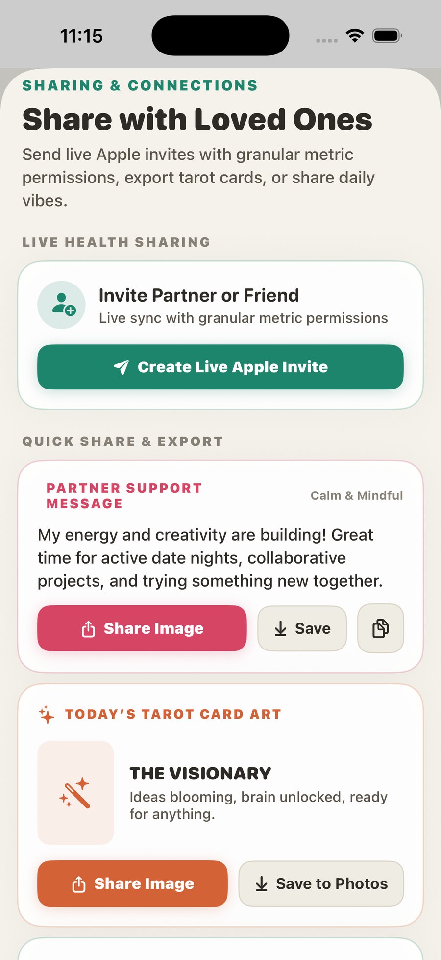
Loop someone in, without loop them into everything
A partner is invited with a one-time QR pairing. Once connected, they see a small, intentional glimpse, like today's view or a short status, with one-tap control over exactly which metrics are shared. Never the full health history.
The core challenge was not building another dashboard. It was designing a more human way to experience the same data.
Careful language, playful visuals, and a clear line between "insight" and "medical advice".
The fun was in the framing
The data was already there. The work was in the interpretation layer: the tone-of-voice options, the tarot-style phase cards, the exact wording that stays warm and personal while making absolutely no medical claim. Everything processes on the device and goes to no third party.
"Your data, with context."
In early beta on TestFlight, heading for the App Store.
A lighter way to see your stats
Glimz is positioned as a playful, private lens on the data you already keep: understand your patterns, enjoy your stats, and share a small glimpse with someone you trust, without sharing everything. Next up is finishing the App Store listing and clearance checks, then launch.
Have an idea like this?
The data was already there. A clear frame turned it into a product with a point of view.