
Navigation Redesign
Customers landing on De Bijenkorf's e-commerce site struggled to orient themselves. I owned the navigation rework from research through to a validated final design.
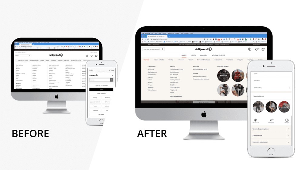
Own it end to end: from card sort to a design that had been A/B tested in production.
Part of a cross-discipline squad focused on how customers orient themselves when they land.
Start with how people actually use it
A usability audit, best practice from Baymard, a look at how competitors solved the same problem. An online card sort to learn how customers themselves group products, and ongoing monitoring of customer surveys.
To see real behaviour, I went through session recordings in SessionCam and ran a data analysis in Google Analytics.
8 categories became 4 worlds
Dames · Heren · Kinderen · Wonen & Vrije Tijd. The same four worlds the physical stores are laid out in.
Match the model people already have
The card sort and the store layout pointed the same way: customers already think in worlds, not in a flat list of eight top-level categories. So the new top level had four, each one a world you could step into.
Sketch → Marvel prototype → in-store customer testing → the full UX team → a locked direction.
Refined against real customers, in the store
Ideas were discussed with business and design, mocked in Sketch, and made clickable in Marvel. I ran in-store testing with that prototype to find where it needed work, then reviewed the patterns with the full UX design team before committing.
A robust navigation system, built to be modified efficiently. A huge project with huge impact.
Shipped, documented, and proven
Final designs went into the Zeroheight design system with usage docs for developers and designers, and I created the Jira tickets. For rollout, I worked with business stakeholders to write the hypothesis and requirements for the A/B test that proved the change out.
Structure that doesn't fight your users?
Research-led information architecture, from card sort to shipped and tested.